Migros Kulturprozent | Art Exhibition 2018
_
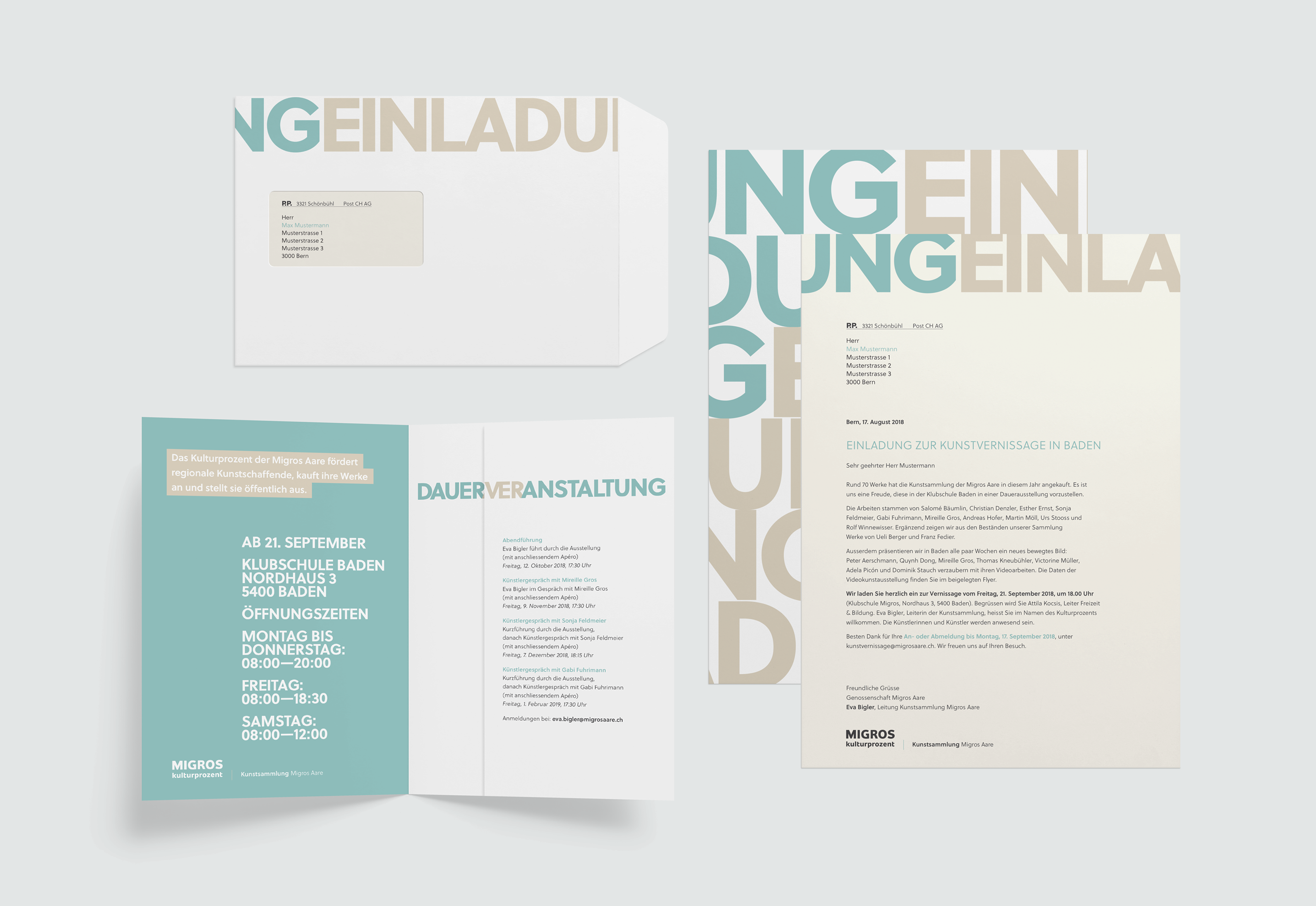
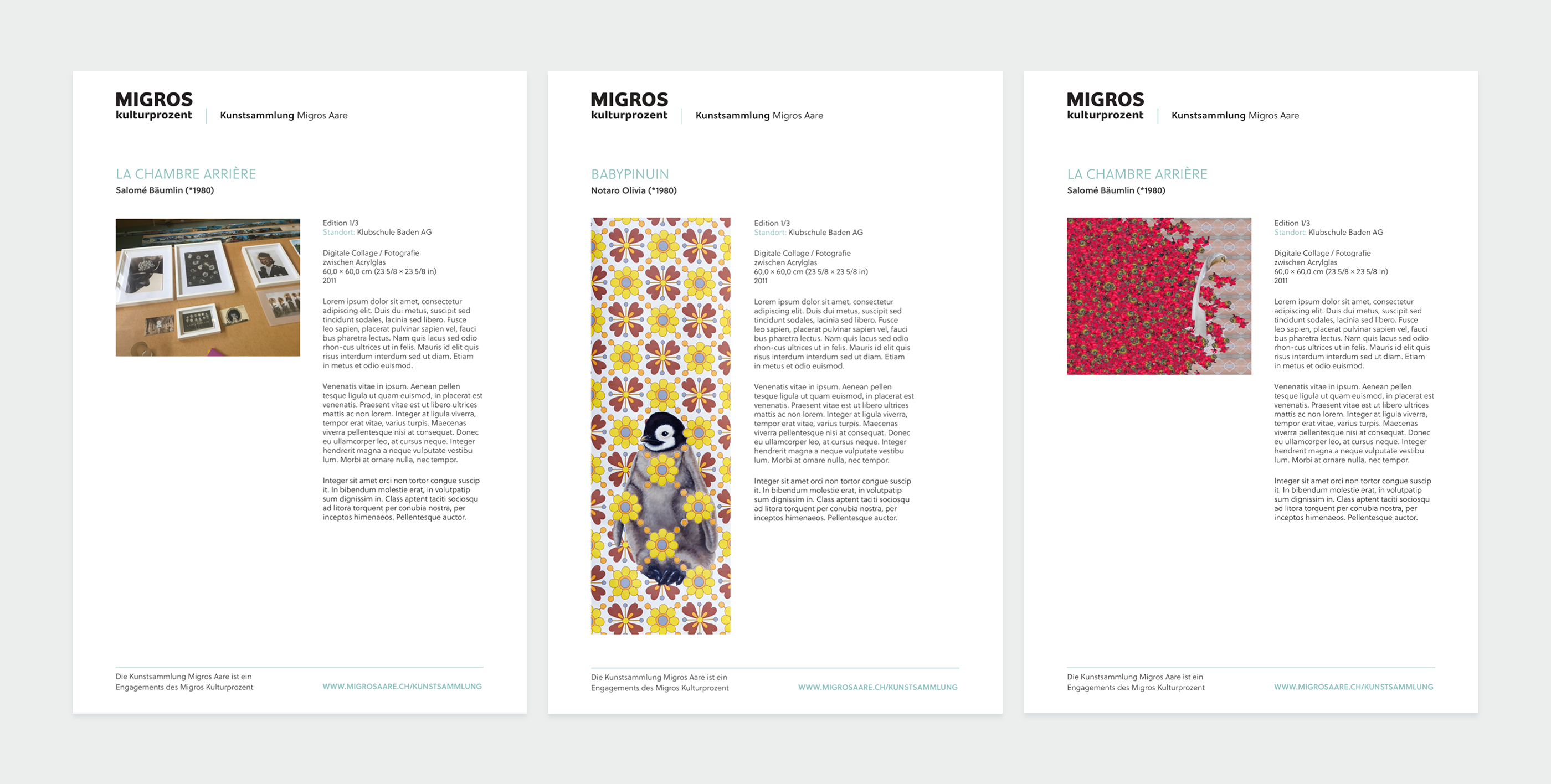
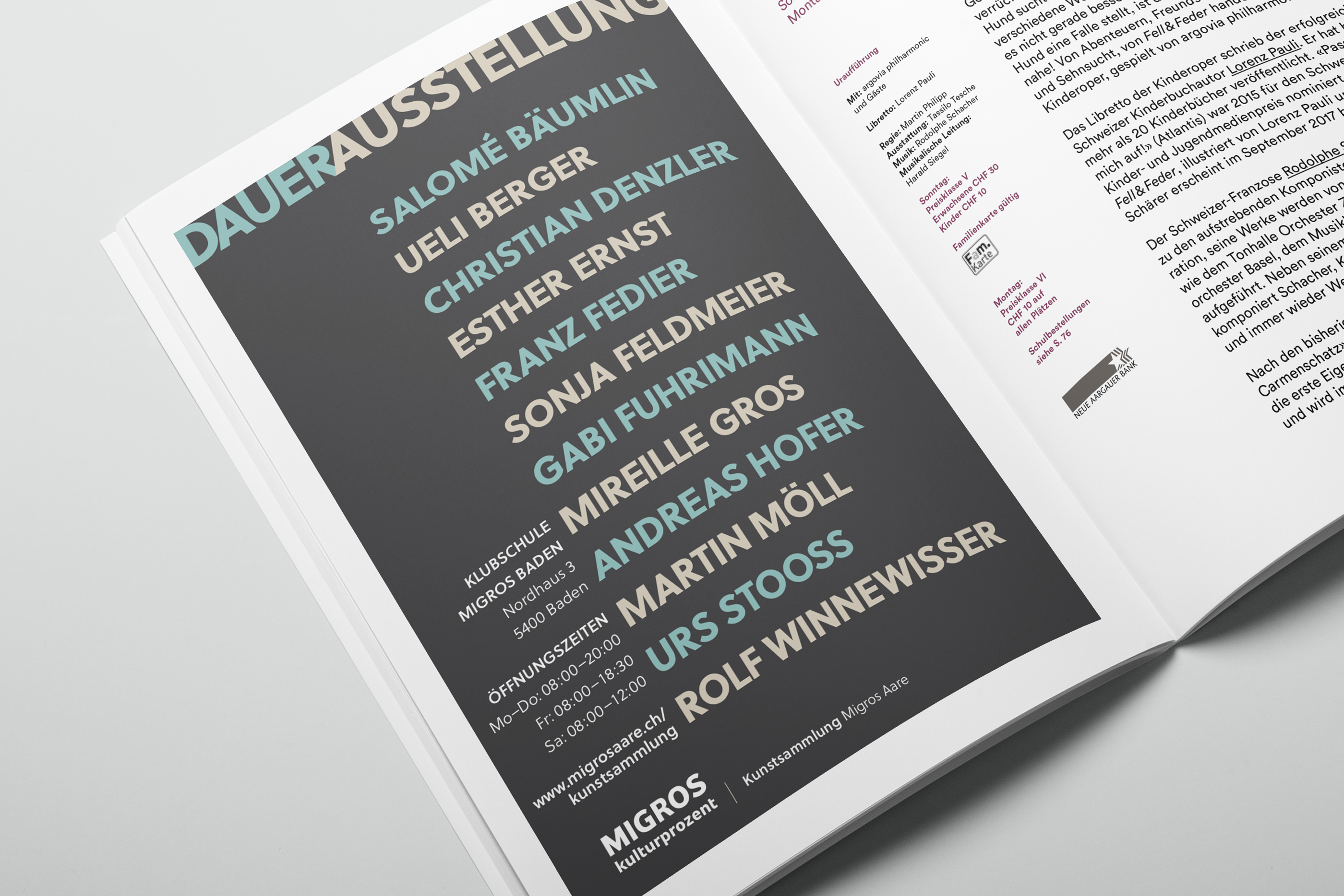
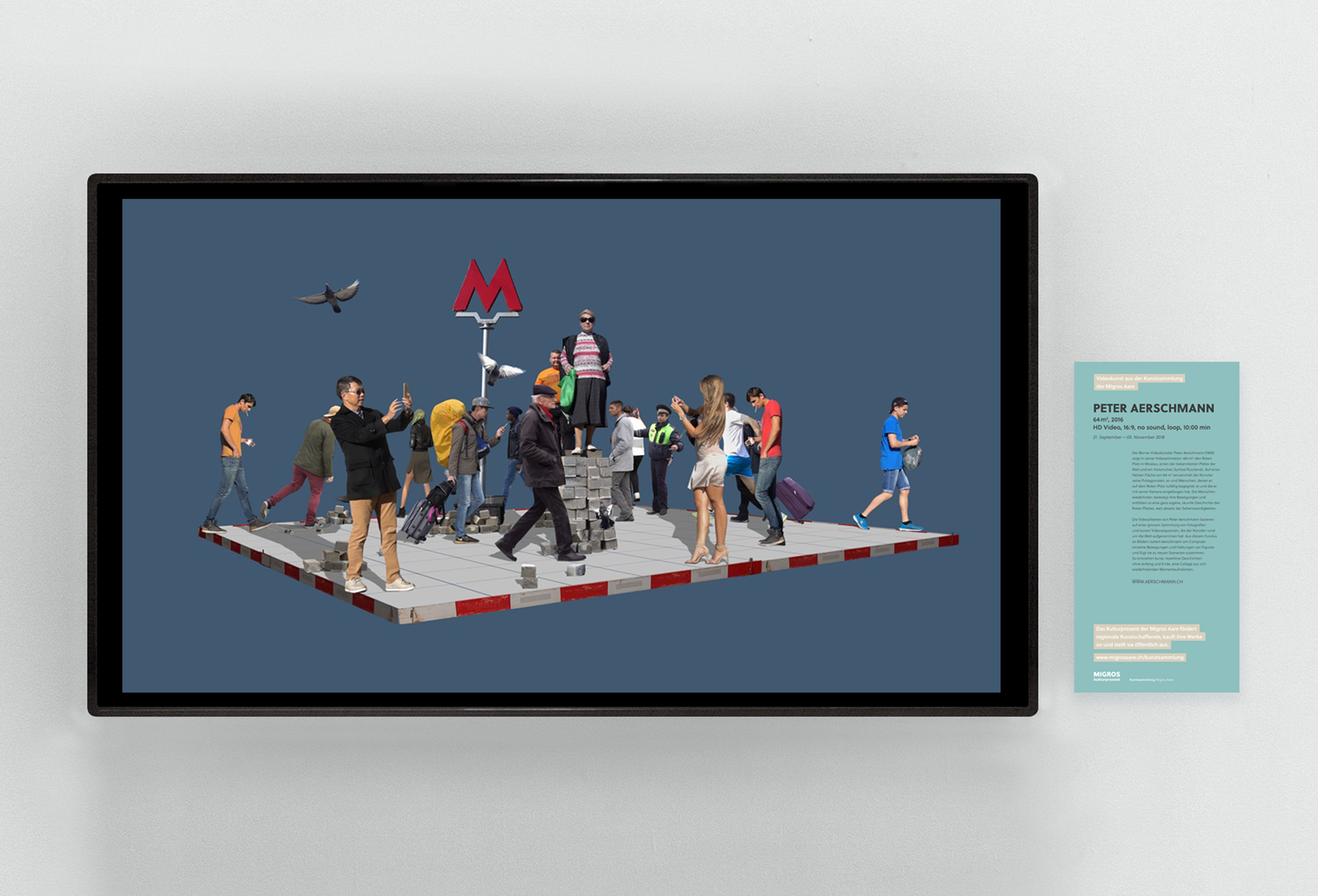
Problem: After the successful project a year earlier, we were invited to expand the design concept to be even bolder and outstanding. This time as well as the invitation pack and artwork labels, we were required to design more touch points for the whole exhibition, such as adverts and changing labels for the video installation.
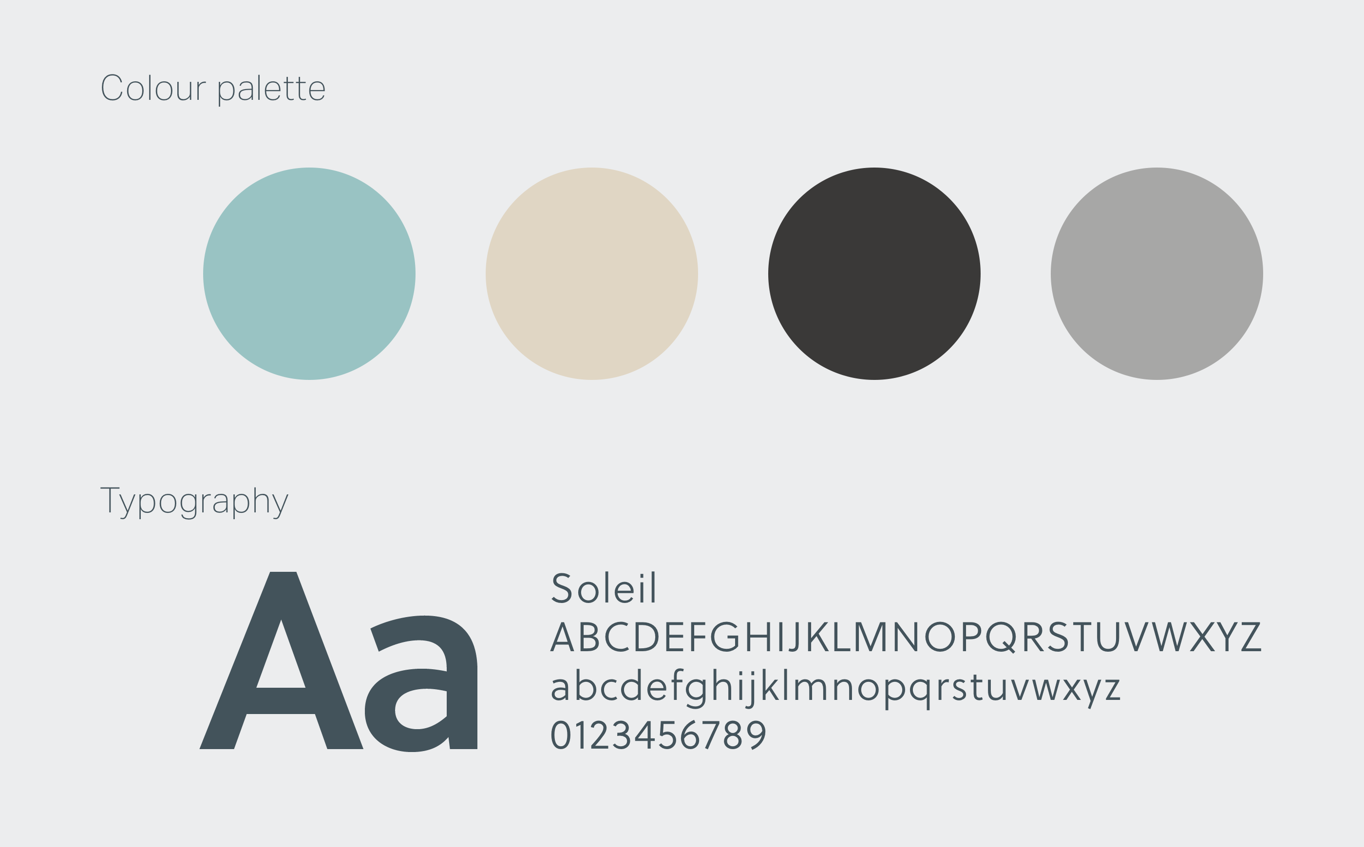
Solution: We kept the already established typography and colour scheme but ventured to a bolder use of typography to make a more striking impact. The exhibition brochure was created to a 16 page folded design, where only one printer in the Berne area was able to print such a long format. Alongside this, an online format was created with downloadable PDFs with the artwork details.
Highlight: To be invited to the opening evening and seeing how the guests interact with the large exhibition catalogue.
_
Changeable label for screen pieces
Changeable label for screen pieces
_
In the Wild
