_
The Northern Block | Experimental Variable Font Microsite
The Northern Block | Experimental Variable Font Microsite
Problem: The Northern Block is an internationally renowned collaborative Type Foundry. One of their most successful font families – Loew – was one of their first fonts offered as a Variable Font and therefore were looking for a partner who not only understands web technology but are font geeks themselves to design and develop an engaging, playful and informative microsite to showcase Loew Variable. With a diverse target audience – from agency creative directors to account managers to font-obsessed designers to end clients, the microsite also had to work visually on a larger than usual variety of screen sizes: mobile phones, tables, laptops and very large desktops (designers).
Solution: It was very important for Jonathan Hill – the founder and designer of Loew – that the microsite tells the story of how Loew started and all the milestones in-between to achieve Loew Variable. Further, in addition to showing all the glyphs in the font, site visitors have to be able to experiment and interact with the font onscreen themselves through a type tester tool and larger paragraphs of text in all language character sets available.
Highlight: It is currently (2022) and we couldn't find an example website where every glyph contained within the variable font is shown an interactive way. on-IDLE had to code a unique library to be able to show all Numerals, Small Capitals, Ligatures & Stylistics Alternates. The microsite content has now developed to such an extent that it can be used as an academic research source.
Go on... have a play to see how flexible and beautiful Loew Variable can be:
_
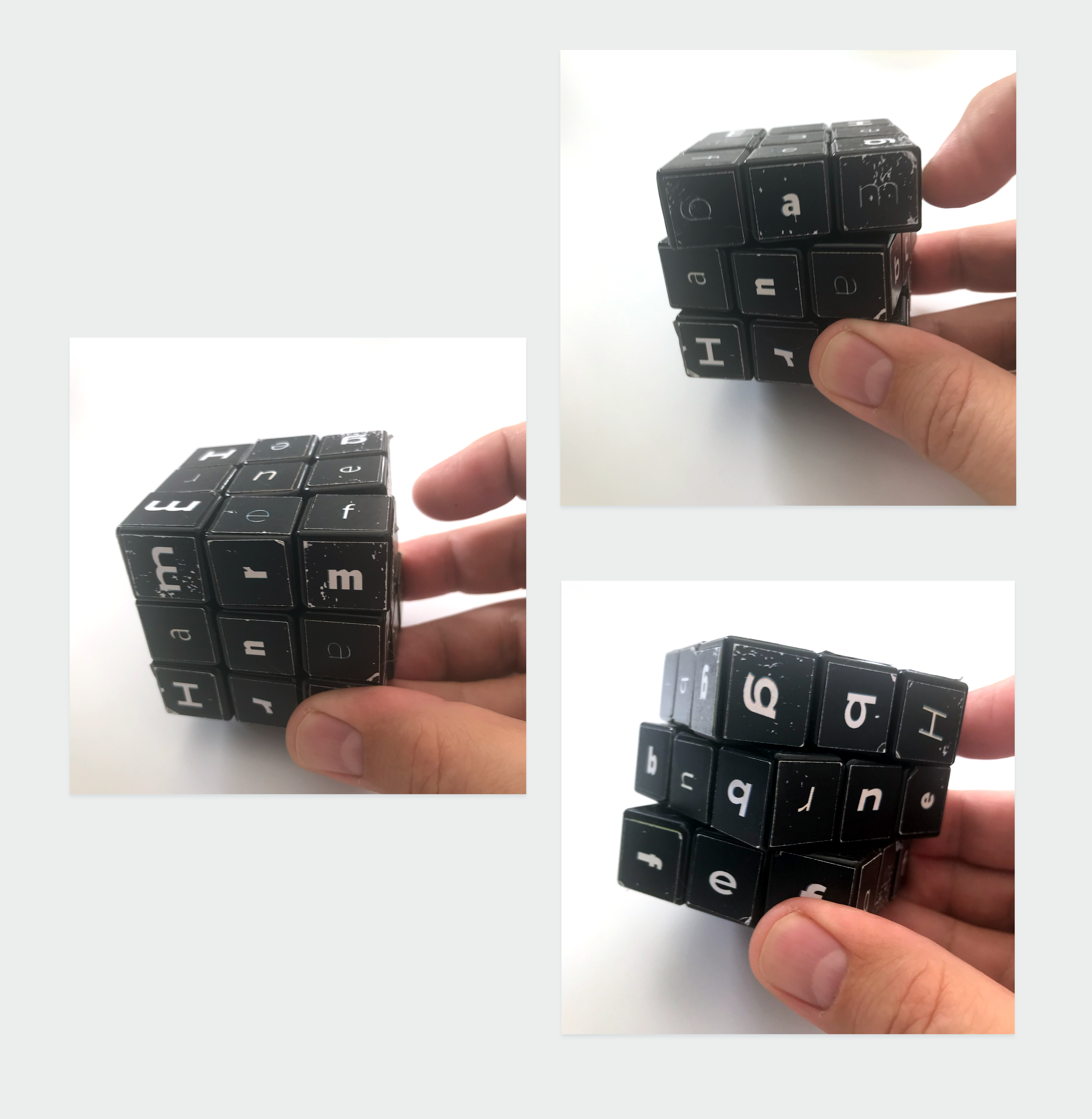
The whole on-IDLE Studio got involved in creating a real cube to demonstrate design concept. The font-rubick's cube underlines the main tenants of the microsite: tactile, playful, modern. Once seen by the client, they fell in L O V E with the Block/Cube idea, with the cube also of course retaining the link to the Northern Block foundry.

_
Dark Mode & Light Mode Mockup created in Adobe XD.

_
All animations were exported in Dark and Light mode and as movie and as animated gif to cater for all situations. Technically, the switch between dark and light mode presented quite a few challenges where buttons, download icons, links, font colour and rollovers had to be hand-coded per instance for a smooth experience as the user switches between the modes.