Third Pillar of Health | Website and Word Template
_
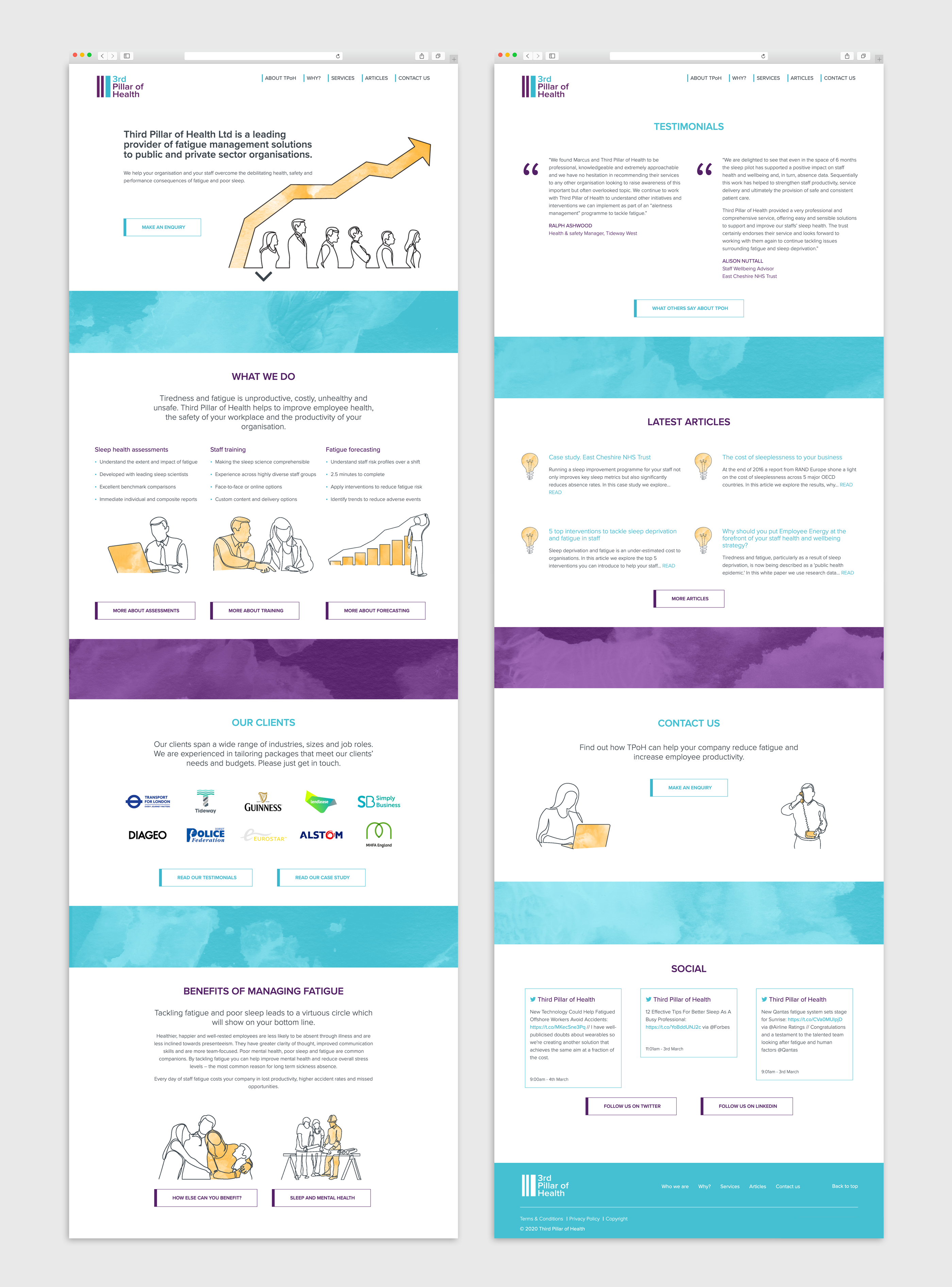
Problem: on-IDLE built TPoH's previous website over a decade ago, so it was time to have a refreshed website, to reflect the organisation's progress and future aims.
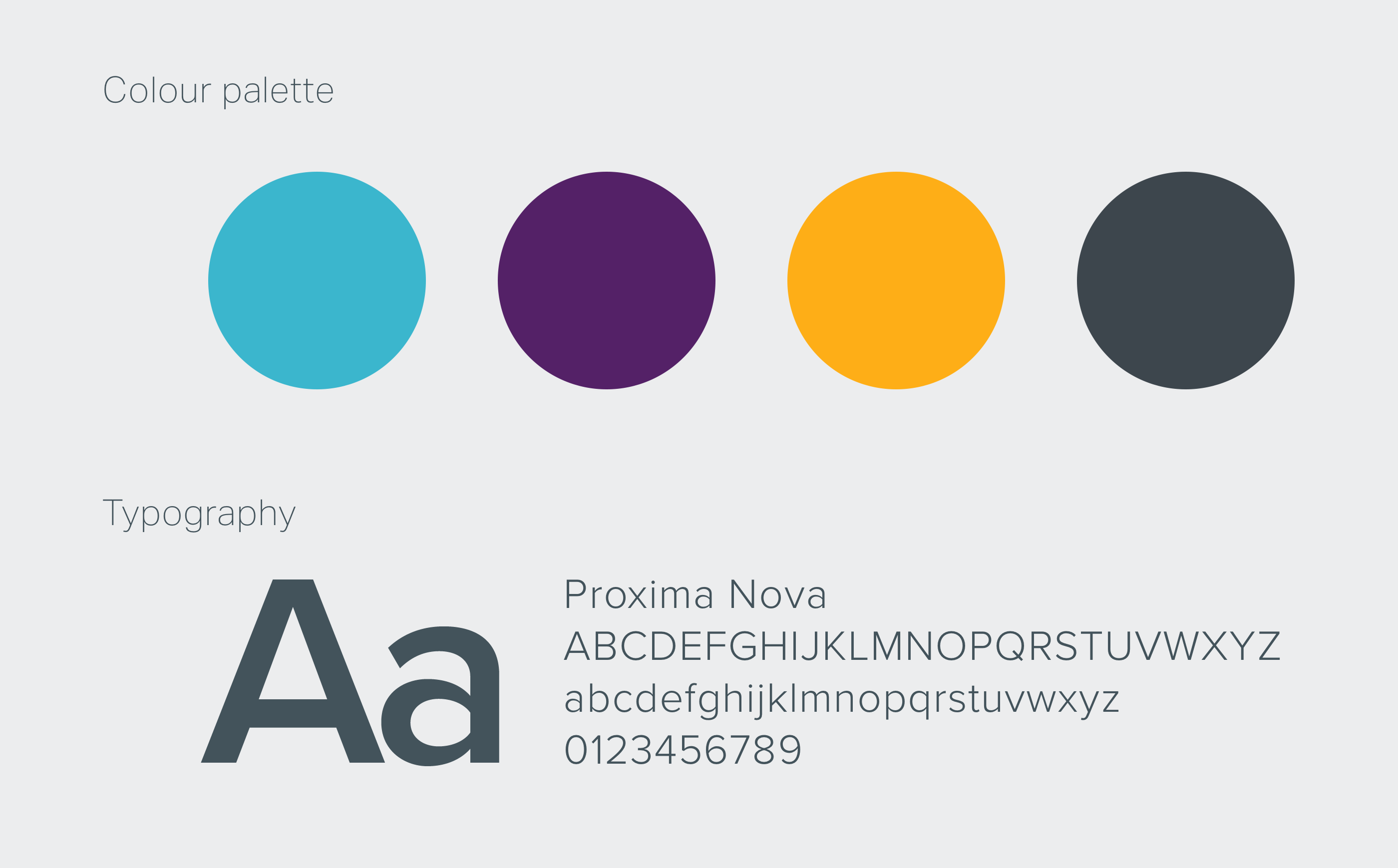
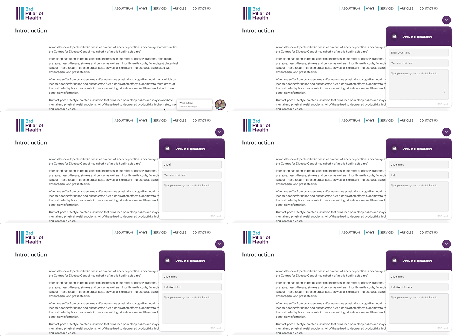
Solution: A contemporary, clean and peaceful website design optimised for mobile, using parallax scrolling to add to the user experience. To update their existing brand identity, we introduced a people-focused illustration style of continuous line with a new accent colour and a dreamy watercolour texture. A chat window and contact form was implemented, alongside a blog module for the use of articles by TPoH from various sources.
Highlight: Being able to play with parallax scrolling as a dreamy transition between sections on the homepage.


_
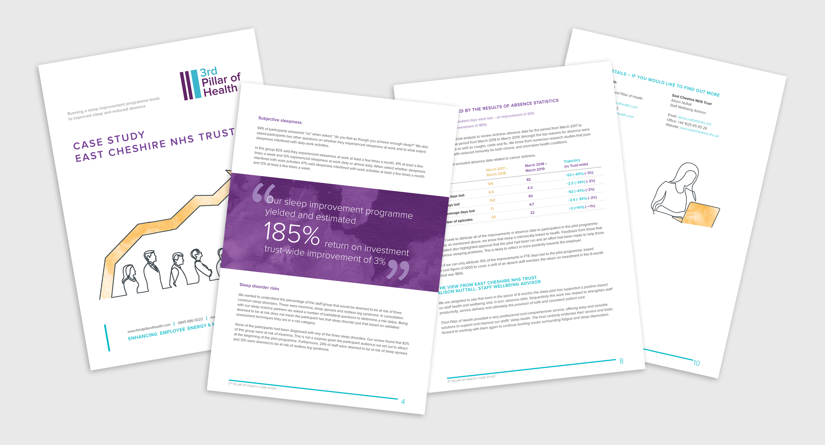
Word Template
To tie in with the visual language of the website, we created a Microsoft Word template for the client to use to format case studies.
