_
Vierte_Stock | Book Design & Production
Vierte_Stock | Book Design & Production
Problem: The fourth_floor (vierte_stock) is a project launched by the Foundation Science et Cité, aimed at Swiss German young adults who are completing a vocational apprenticeship. The project addresses professional learners wherever they are and therefore focuses on social media channels. The aim is to reduce young adults’ inhibitions and reservations about science and research. Early in 2022 the team asked on-IDLE to help them to create a Design System for the publication of the weekly social posts on science topics. Celebrating the 25th anniversary of Science et Cité at the end of 2023, we were approached to design a printed book with a selection of the best Instagram posts to mark the anniversary.
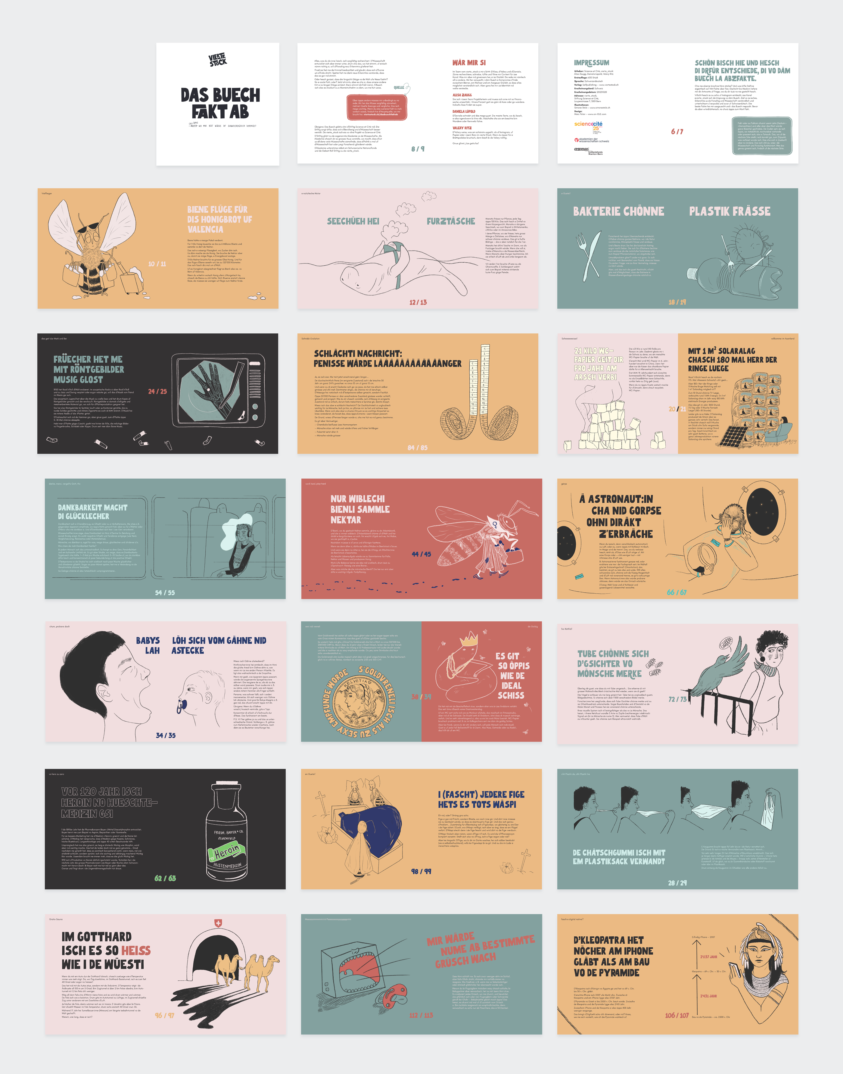
Solution: After a lot of research and scribbles it was clear for us that the square posts have to be presented in a square book format – using the Design System we created for the social assets.
Highlights: Seeing the face of the client when the first copy gets delivered to their office... and enjoying the irony of seeing Instagram posts in print!
The book can be previewed and purchased on the vierte_stock website: https://viertestock.ch/store/
_
The Font combination of Beautiful Freak – for Headlines – and Glacial Indifference – for Copy text – was already introduced for the Branding of the social media posts across TikTok, Instagram, YouTube & Spotify.
The Font combination of Beautiful Freak – for Headlines – and Glacial Indifference – for Copy text – was already introduced for the Branding of the social media posts across TikTok, Instagram, YouTube & Spotify.

_
The Font Beautiful Freak has an exceptionally high amount of glyphs and ligatures – which were used with love to keep the typography exciting for the reader, and to cope with the as yet, unwritten, Swiss German dialect.
The Font Beautiful Freak has an exceptionally high amount of glyphs and ligatures – which were used with love to keep the typography exciting for the reader, and to cope with the as yet, unwritten, Swiss German dialect.

_
The Book was printed in Switzerland and has a page size of 175 × 175 mm and a total of 108 pages.
The Book was printed in Switzerland and has a page size of 175 × 175 mm and a total of 108 pages.


_
The layout is based on a 9 × 9 square grid to have maximum flexibility and make sure each page can honour the amazing illustrations – created by Simone Stolz www.simonestolz.ch
The layout is based on a 9 × 9 square grid to have maximum flexibility and make sure each page can honour the amazing illustrations – created by Simone Stolz www.simonestolz.ch


_
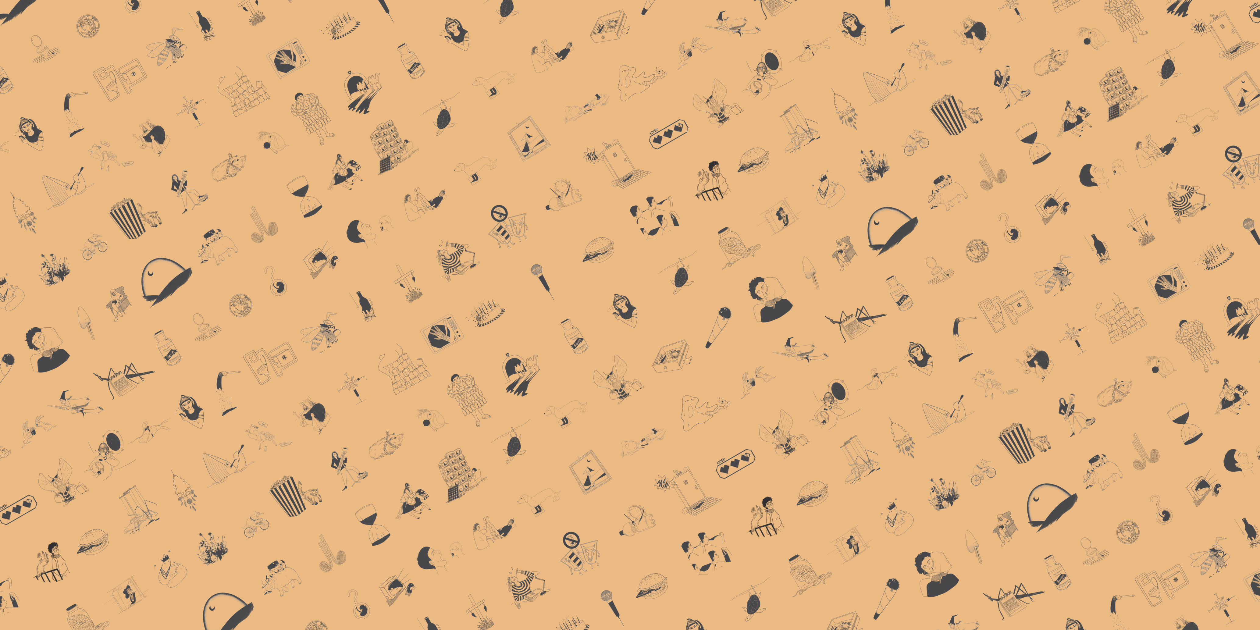
These great illustrations – converted to simple black – were perfect to use for the endpapers at the beginning and ad the end of the book.
These great illustrations – converted to simple black – were perfect to use for the endpapers at the beginning and ad the end of the book.

_
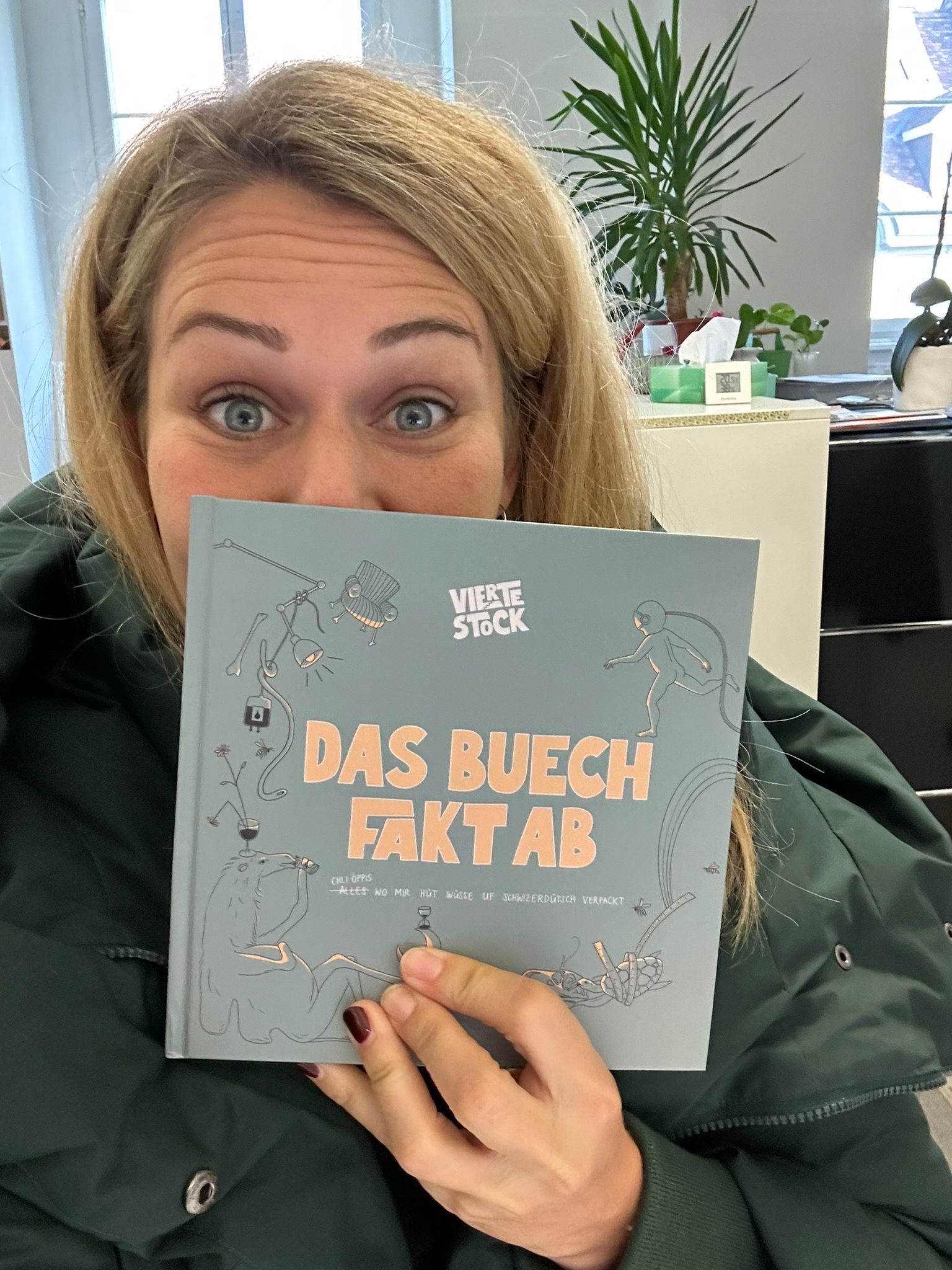
In the wild: Relating to the Highlight above, this is the excited face of the client – who is very happy to hold the first copy in hand.
In the wild: Relating to the Highlight above, this is the excited face of the client – who is very happy to hold the first copy in hand.
